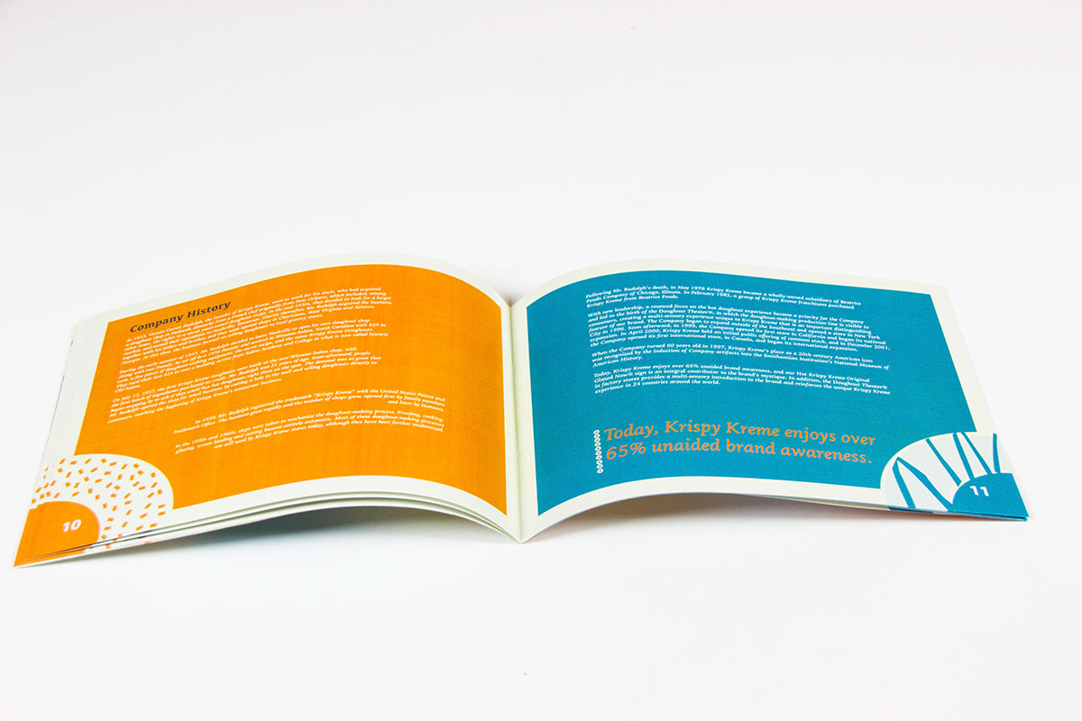
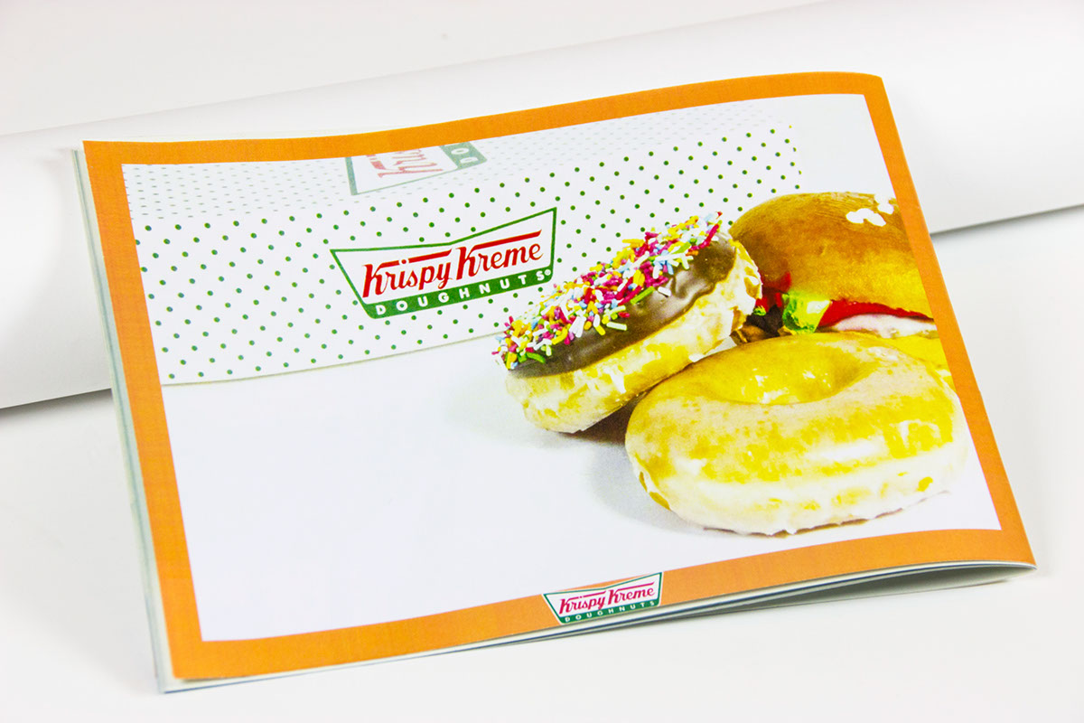
The aim of this project was to demonstrate a sound understanding of the interactions between type and other visual components in complex bodies of information. This annual report is for Krispy Kreme.
The colour scheme I chose is towards a friendly and warm vibe that makes more pleasant to read and look at despite having a lot of text as well as using a lot of info graph to help break down important information for the reader.


